Reviewing the different columns will help you identify if you need to go back to a previous step and add or edit anything for your calculations and analysis. You can also add a “Target” to create a goal for your indicators, in the last column on the right.
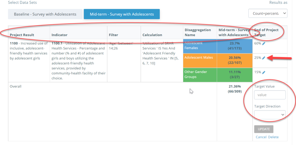
Scrolling down, you will also see any disaggregation you have set for your datasets.
Kinaki will automatically generate information for your analysis from what you have provided, including simple statistics for your selected data sets, and measurements using a visual graph.
You can change the visual for your responses between a bar or line graph, or a circle (pie) chart, using the “Select Chart” function on the left side of the page.
To export the data or the results from this analysis, choose from the options at the end of the Results tab.