Analyze Data
Analyze Data for a Specific Indicator
Data analysis is a key feature of Kinaki’s MEL experience. To analyze your data, there must be some dataset submitted for analysis and ideally also some indicators connected to the data collection tool.
What is the analyze data page about?
On this page, you can use collected data sets to measure progress towards project indicators that were defined during the “Design Project” stage.
To begin, ensure that a Data Collection tool (with a submitted data set) is selected from the drop-down menu at the top of the page.
How can I select an indicator to analyze?
Using the drop-down menu from the “Select Indicator” function, choose the indicator you want to calculate from the list of measures associated with the data collection tool.
You may also choose to “Add a new indicator +” to create one from scratch – but make sure any new indicators are connected to the chosen data set via the appropriate Data Collection Tool.
With an indicator selected, you can review (and edit) the indicator through the “Indicator details” tab.
How do I calculate the results of my indicator?
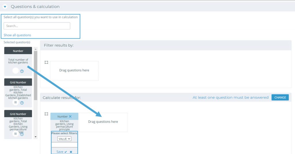
Using the “Questions & Calculators” tab, you can organize your analysis.
On the left side of the page, you will see a list of relevant questions for the chosen indicator. If the question you wish to include in the calculation is not present, select “Show All Questions” and choose one from the list. You can also use the search function to sort through the list of indicators.
Use your cursor to click on and drag these questions into the “Calculate results for” section.
To confirm the inclusion of your question, select a calculation option from a list of filters. For questions with answer options select the answers that were to be provided. For numerical responses, you will have the option to filter by more (>), less (<), or equal (=) than a set value. To select all values, choose “VALUE”. For written responses, consider the number sequence associated with each response (for example, yes or no may correspond to 1 and 2).
How do I disaggregate the results of an indicator?
To create a compelling analysis, you can disaggregate the data. This disaggregation will separate responses in the analysis based on the responses to the questions included in the disaggregation calculation (location, gender, etc.).
You can add any number of disaggregation lines to your indicator. It all depends on what analysis you want to undertake. A good practice is to begin with a single choice question and disaggregate your data with the pre-set responses. For example, participants might be asked what community they are from, and select from a list of three responses (A, B or C) – allowing the data to be disaggregated to highlight the different locations that participants are from.
Each disaggregation line will create a unique section in your analysis. Additional disaggregation lines can be added with the “Add New Row” button on the right side of the page.
Drag-and-drop a question and select the appropriate response to disaggregate your data. Multiple questions may feed into the same results.
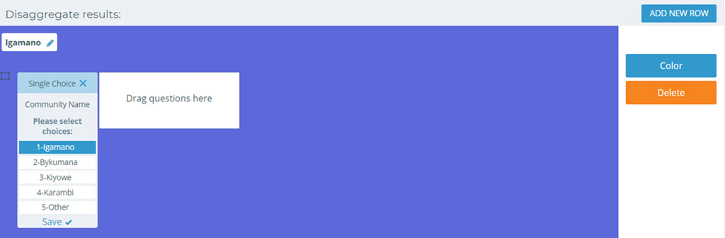
When you are satisfied with the disaggregation of your data, select “Calculate Results” at the bottom of the section, and continue onto the “Results” tab.
Explore Collected Data
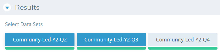
How do I see the results of my indicator for the different datasets?
Under the Results tab, select the appropriate responses to load into your results. These are completed by selected the previously submitted data sets. Loaded data sets will have a green bar below their title, and selected data sets will highlight in blue.
How do I review the data analysis?
To continue, review the information to generate the analysis under “Project Result”, “Indicator” and “Calculation”. If appropriate, you may add a “Target” to create a goal for your indicators.
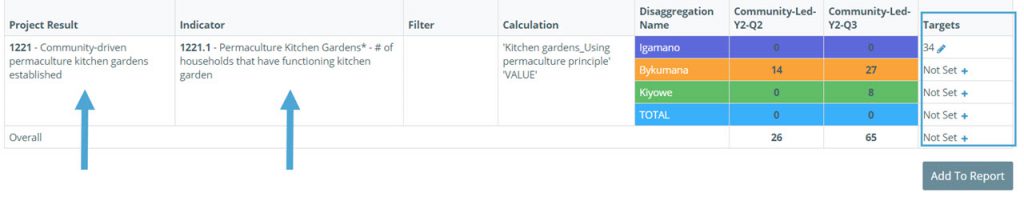
Using this information, Kinaki will automatically generate information for your analysis, including simple statistics for your selected data sets, and measurements using a visual graph.
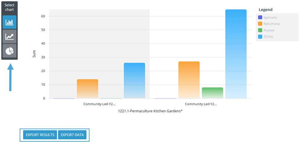
The visual for your responses can be changed between a bar or line graph, or a circle (pie) chart, using the “Select Chart” function on the left side of the page.
To export the data or the results from this analysis, choose from the options at the end of the Results tab.
Using the final section of the page, “Result Analysis”, project admins can input written commentary associated with the data set analysis.
Complex Data Analysis
How do I preform more complex data analysis?
Using the “Analyze Data” page, you can input multiple questions to create a more complex calculation for an indicator. This will also give you detailed information about answers to each of the questions included in the calculation.
To undergo more detailed analysis, you may select to include multiple questions, filters, or disaggregations within your “Questions & Calculations” tab.
Selecting additional data sets will also demonstrate progressive responses over multiple data entries (such as for chronological reporting of responses across different time periods).